
#ZUKUNFT: “IS QUANTUM COMPUTING CHANGING OUR FUTURE?” – IN CONVERSATION WITH CARLO ROVELLI
“The risk is of human stupidity, not artificial intelligence.”
Interview by Marie Dapoigny

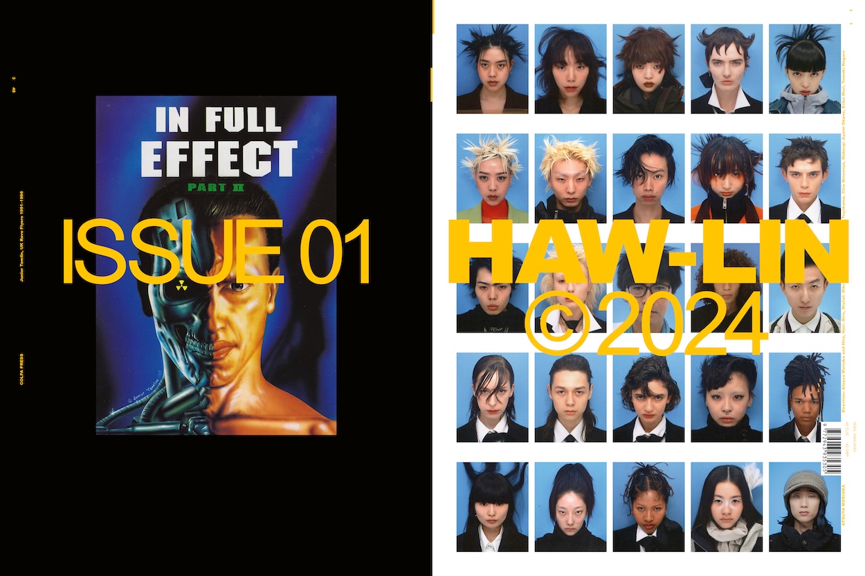
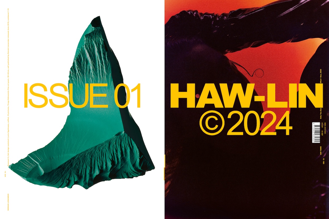
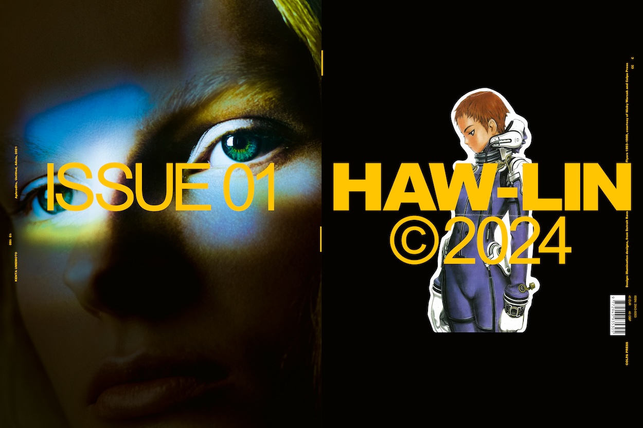
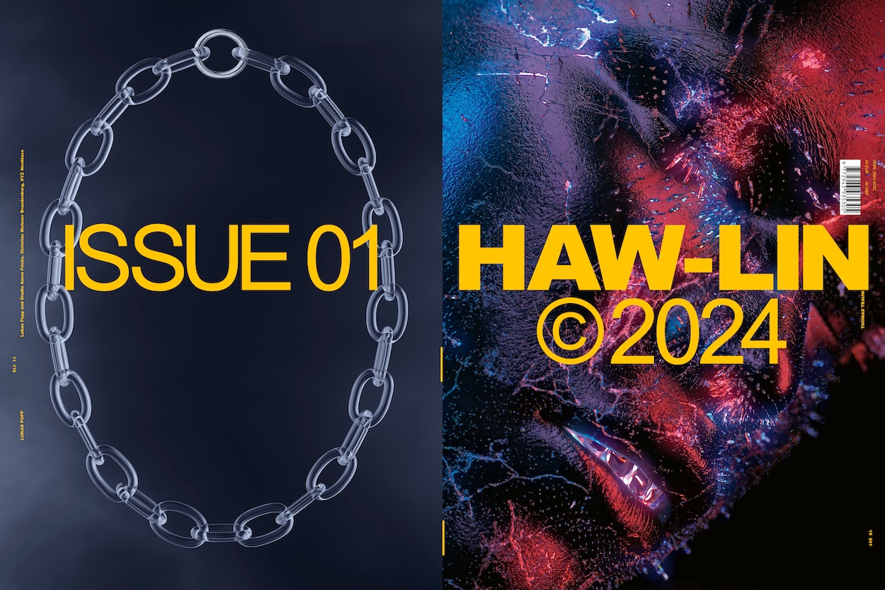
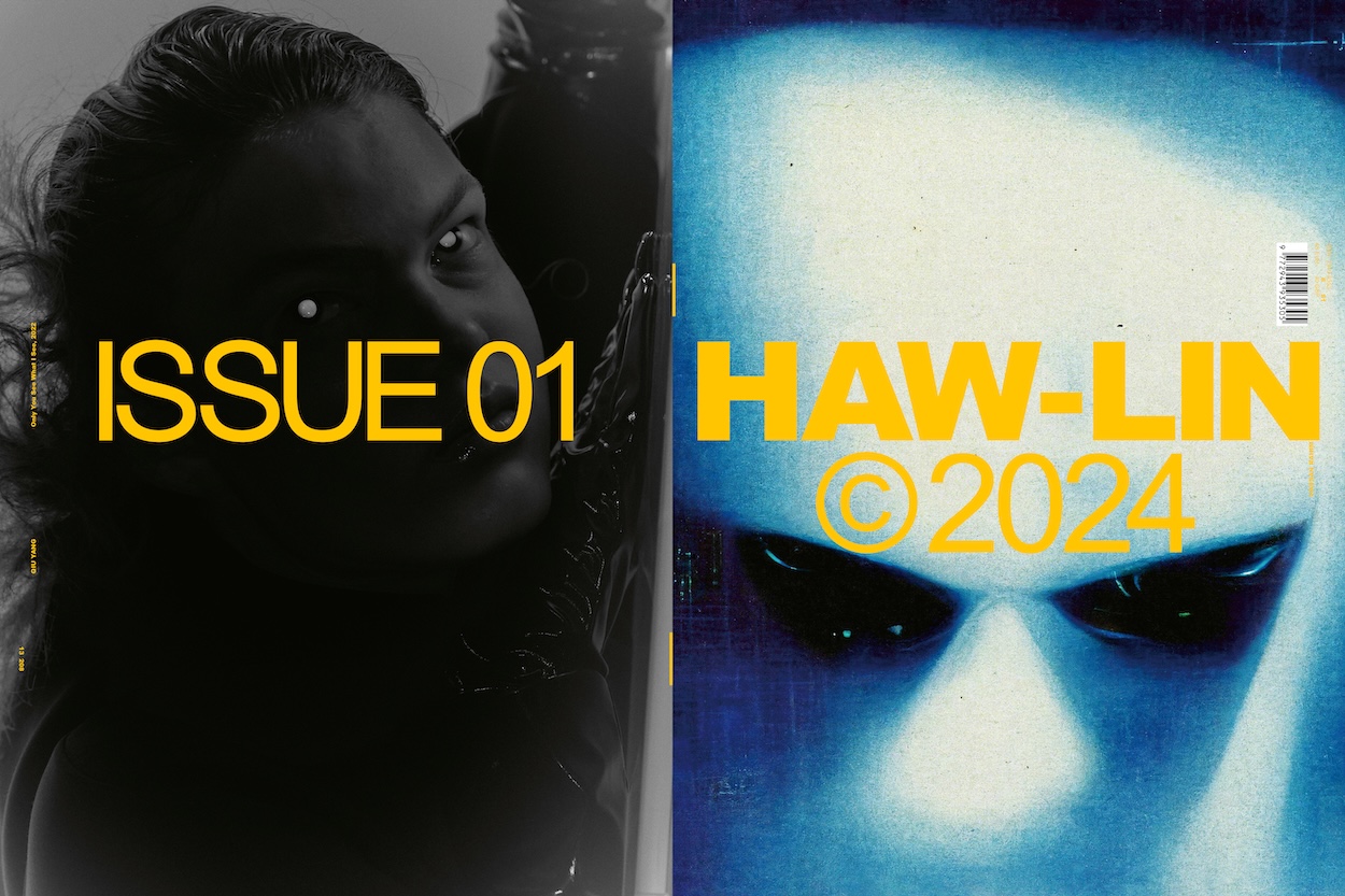
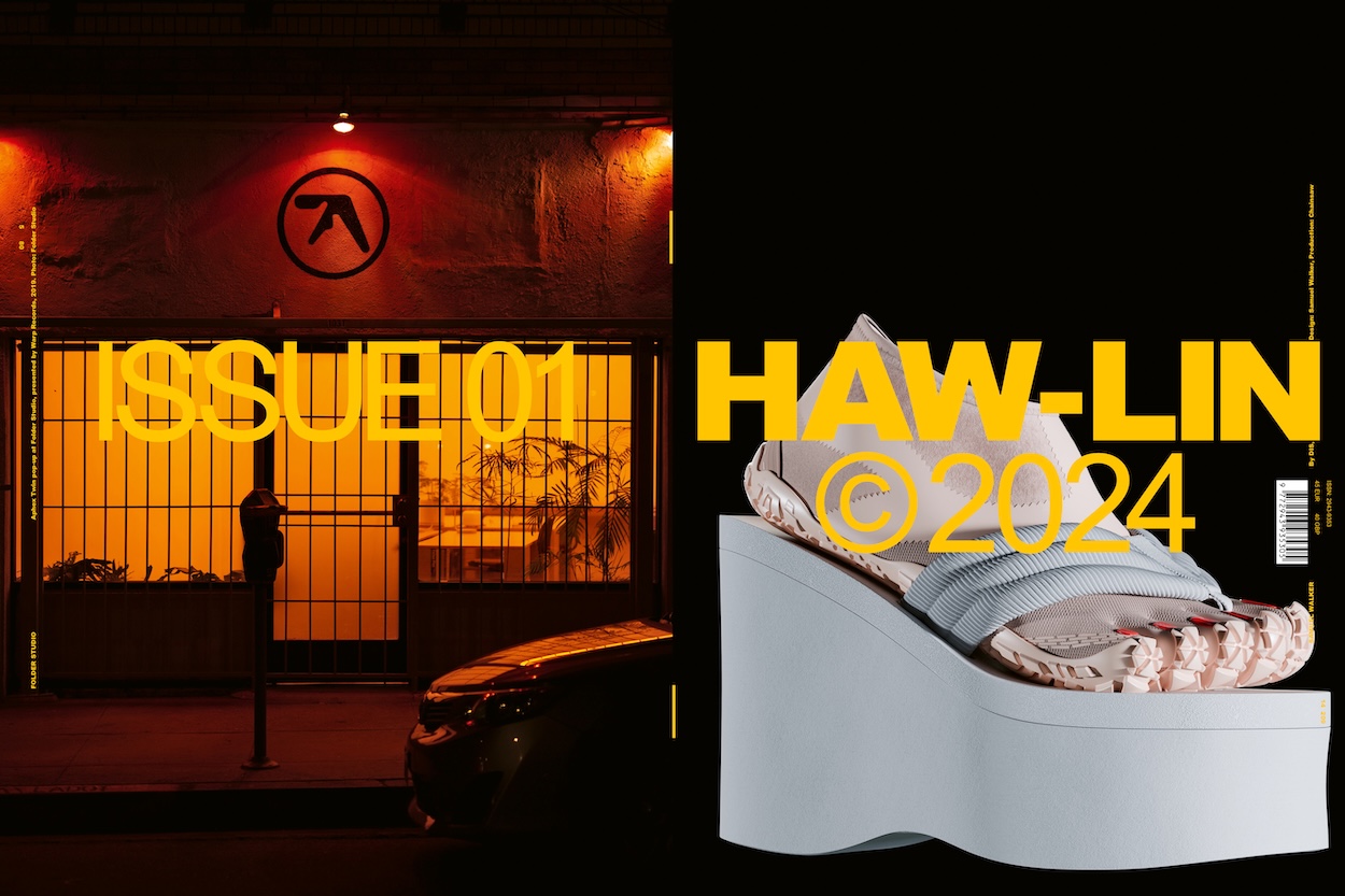
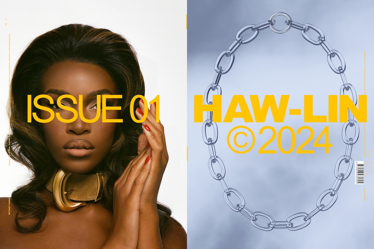
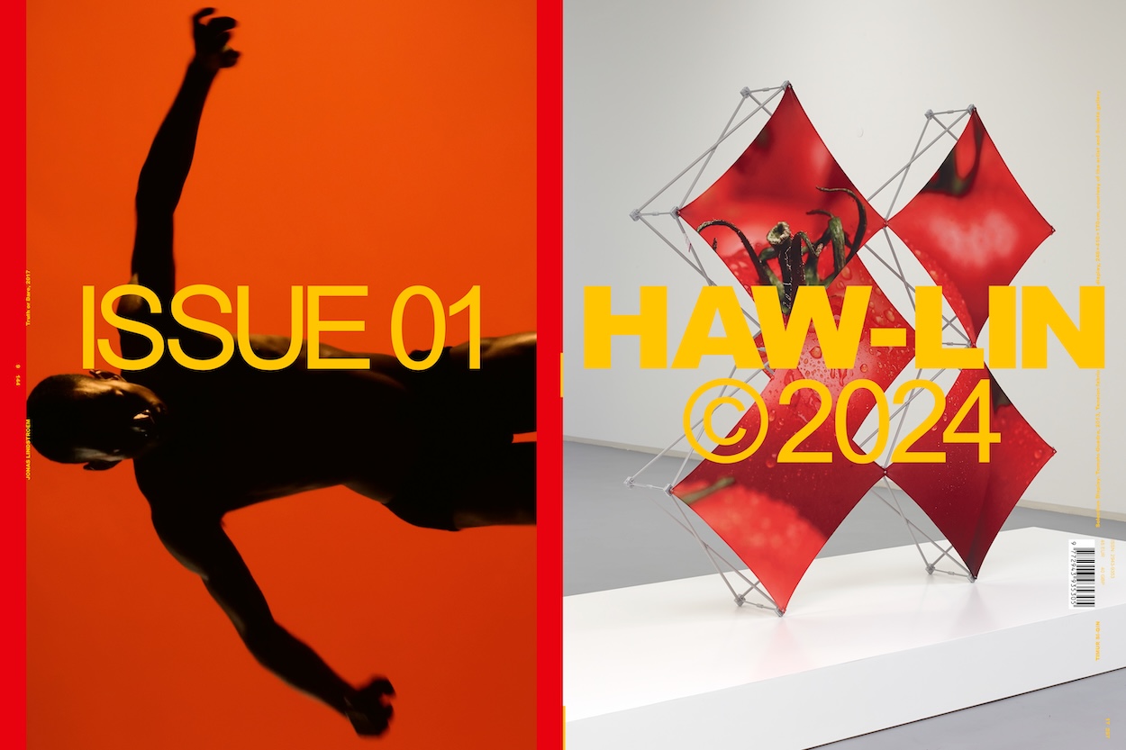
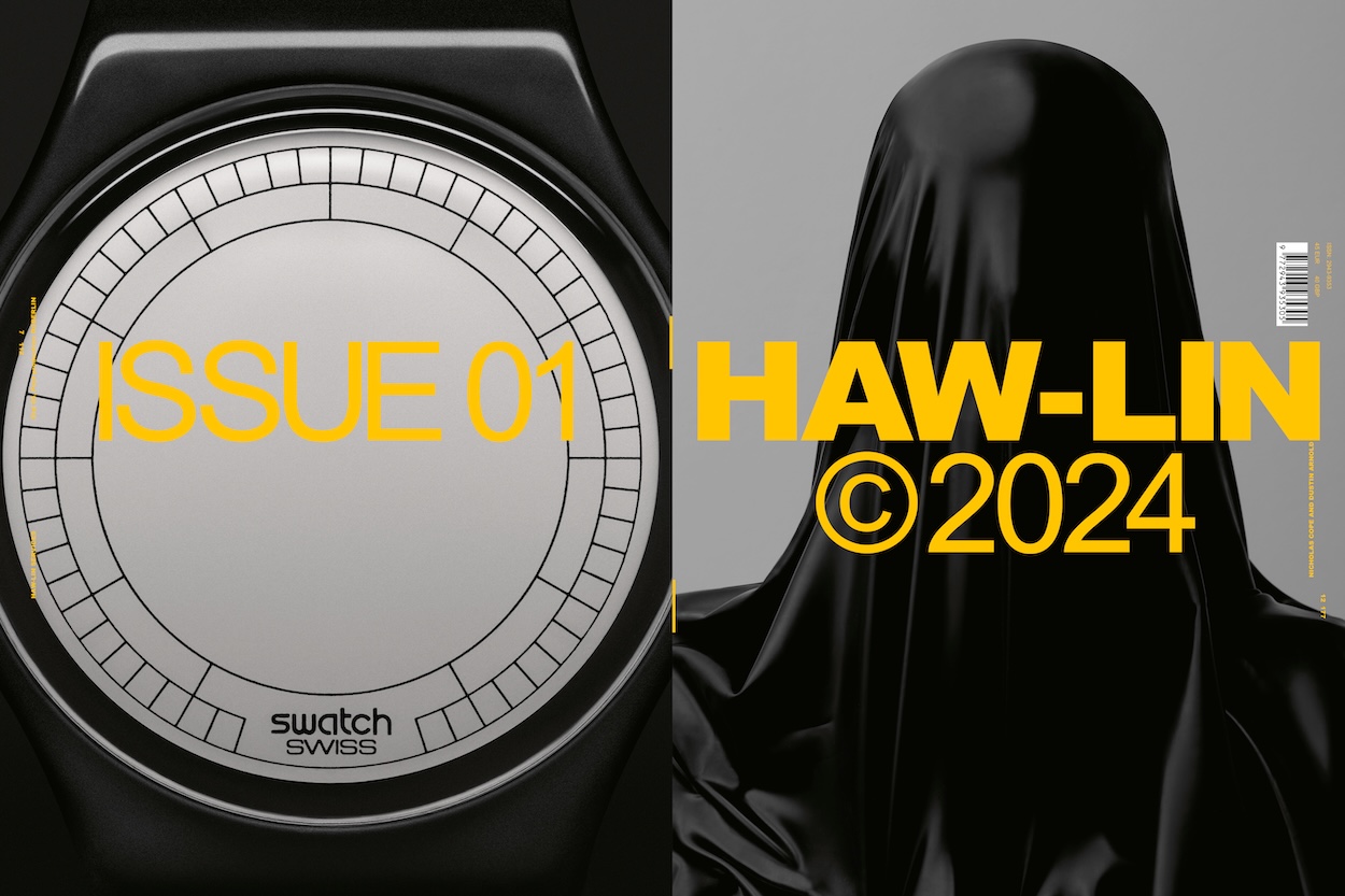
HAW-LIN – from digital mood boards to print
For over a decade, Jacob Klein and Nathan Cowen, the creative minds behind Haw-lin, have been curating a unique visual dialogue that blurs the boundaries between design, art direction, and photography. What began as a simple online mood board in 2008 has evolved into a celebrated platform and creative agency. Now, the duo is venturing into the world of print with the launch of Haw-lin Magazine Issue 01 in Berlin. We asked Jacob and Nathan to share the story behind their partnership, the evolution of Haw-lin, and their inspirations for the magazine. From the magazine’s innovative production process to its diverse contributors and 17 unique covers, the founders give us an inside look at their creative journey and their vision.
Jacob: We actually met in 2008 in Berlin, when we were design interns at the agency Hort. We shared a desk, and that close working environment laid the foundation for our collaboration.
Nathan: Exactly. Working side by side at Hort helped us realize how well our aesthetics and approaches complemented each other. That initial experience evolved into an ongoing dialogue that eventually became Haw-lin. Haw-lin actually began as a simple solution when we eventually moved desks at Hort. We still wanted to share ideas, references, and inspirations with each other, but doing so physically became less practical.
Jacob: So we started Haw-lin as an online mood board – a way to exchange the visual material we found inspiring. It was casual at first, just a personal space for our creative dialogue. But as we curated more intentionally, the platform gained traction and took on a life of its own, becoming the foundation for what we do today.
Nathan: The decision to formalize our collaboration into Haw-lin Services came naturally. We wanted to expand on the visual language we were building and apply it to commercial projects. The agency, beginning with design and art direction, eventually evolved into what it is today, us as a duo exploring photography and film in a more hands-on, collaborative way.
Jacob: The inspiration was gradual—Haw-lin, as a platform, gained momentum and attracted attention. It became clear that our shared aesthetic had a unique appeal and a potential beyond just a personal project.
Nathan: There wasn’t a single defining event, but rather an accumulation of opportunities. Brands and collaborators reached out, and we realized this could be something much bigger.
Nathan: The name doesn’t have a literal meaning – but it is a literal combination of Hawaii (where I am originally from) and Berlin (where we met). It’s ambiguous and open to interpretation, which mirrors the flexibility and breadth of our projects.
Jacob: It wasn’t so easy to somehow integrate the name of my hometown Rheda-Wiedenbrück…
“We’ve always had a desire to craft a physical product –something tangible that reflects our aesthetics and creativity.“
Nathan: Music has always been a natural extension of our visual work. The creative process is somewhat similar – we’re arranging moods and telling stories, but through sound instead of imagery.
Jacob: I was actually co-founder of a drum and bass label way back when, but the love for sound and music has always been there. These days, when possible, we also produce sound design for our films. It allows us to create a fully immersive experience, tying the visual and auditory elements together. The themes in our music often reflect minimalism, atmosphere, and a sense of place, echoing the aesthetic of our visual work.
Jacob: The idea of creating a magazine has been in the back of our minds for years. We’ve always had a desire to craft a physical product –something tangible that reflects our aesthetics and creativity. It was also a way for us to maintain a connection to graphic design, which has always been central to our practice.
Nathan: Beyond that, the magazine offers a platform with a more direct line to our collaborators and clients. It allows us to showcase the kind of work we’re passionate about, while opening up opportunities for deeper, more meaningful collaborations. The timing finally felt right, and the process of making it has been a great way to expand on Haw-lin’s creative dialogue.
Jacob: We’re working closely with a distributor who shares our vision and understands the importance of aligning with stockists that reflect our values. Independent bookstores, concept stores, and spaces that prioritize design, aesthetics, and storytelling are our main focus.
Nathan: It’s about finding partners who appreciate the thought and craft behind the magazine.
“During production, the printer shuffled these sections right before binding, creating 17 unique combinations of covers and page orders.“
Jacob: The contributors are people whose work we admire and who share a similar approach to visual culture. It was a mix of long-standing relationships and new collaborations.
Nathan: We were interested in input that could expand the dialogue we’ve built over the years. Initially, we planned to keep the magazine small and intimate, focusing solely on contributions from our studio mates and close contacts. It was meant to be a more personal project.
Jacob: But as we started developing it, the concept organically grew and expanded to over 100 contributors. We realized there was potential to expand and involve a broader range of voices, so we decided to reach out to a much wider circle of contributors. This shift gave the magazine a richer, more layered perspective than we originally envisioned.
Jacob: The 17 different covers are a direct result of the magazine’s design and printing process. Each cover also has a unique page order, which was generated by the way the content was structured.
Nathan: The magazine was designed chronologically, based on the first names of the contributors, and divided into 17 print signatures – dictated on the page count. The cover and back cover designs were printed on the first and last pages of each section. During production, the printer shuffled these sections right before binding, creating 17 unique combinations of covers and page orders. This process makes each copy feel like one–of-a-kind. The end result might not be immediately obvious to the reader, but we felt that it was a Democratic approach to the cover selection, albeit a somewhat complicated one. We really like that the print process has a direct influence on the page order.
Jacob: In the future, we want to dive deeper into specific topics, use the magazine to discover itself in a way.
Nathan: Above all, we want to have fun with the process. The magazine is an opportunity to discover new ideas, meet artists we admire, and make new connections. We’re excited about continuing to create something that feels fresh and engaging, at least to us.
“The risk is of human stupidity, not artificial intelligence.”
Interview by Marie Dapoigny
LA-based artist Reine Paradis will soon be coming to Berlin to present her newest body of…
All images courtesy of the artist
If, like me, you’re a techno head—wedded to dark dancefloors, addicted to sonorous…
Words by Liam Cagney